QlikView provides nice options to display certain records with specific requirements, such as Top N, Top N percent, etc.
Unfortunately, there is no simple way to display both Top M and Worst N records in single Chart as there is no such options. It is still possible to make the chart with calculated dimensions.
Unfortunately, there is no simple way to display both Top M and Worst N records in single Chart as there is no such options. It is still possible to make the chart with calculated dimensions.
Using Dimension Limits for displaying Top N records
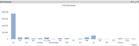
Let's say there are sales records and we only want to display Revenue in Top 5 region. The solution is straight forward by using dimension limits.
Let's say there are sales records and we only want to display Revenue in Top 5 region. The solution is straight forward by using dimension limits.
- Right Click "Properties..."
 |  |
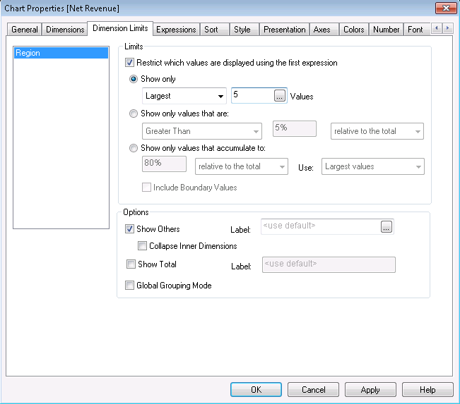
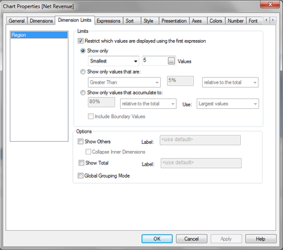
- Click "Dimension Limits"
- Click "Restrict which values are displayed using the first expression"
- Show only "Largest" 5 values and "OK"
 | 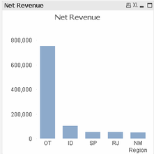 |
To display Worst 5 revenue, the steps are the same except you need to choose "Smallest" instead of "Largest".
Now we could build the same chart using calculated dimension.
Using Calculated Dimension for displaying Top N records
Using Calculated Dimension for displaying Top N records
- Right Click "Properties..."
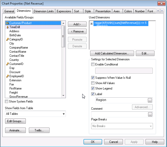
- Click "Add Calculated Dimension..."
- Use the following expression
=aggr(If(RANK(aggr(sum([NetRevenue]), [Region])) <= 5
, [Region])
, [Region]
)
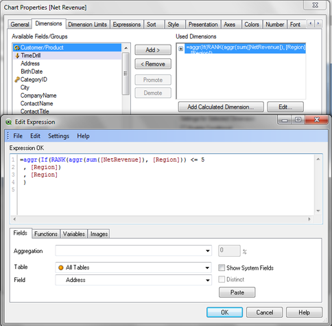
- Click "Suppress When Value Is Null" and "OK"
To found bottom 5 records, the expression is similar but the aggregate value need to multiplied by -1.
=aggr(If(RANK(aggr(-1 * sum([NetRevenue]), [Region])) <= 5
, [Region])
, [Region]
)
=aggr(If(RANK(aggr(sum([NetRevenue]), [Region])) <= 5
OR RANK(aggr(sum(-1 * [NetRevenue]), [Region]))<= 5
, [Region])
, [Region]
)
Top 5 and bottom 5 records could be displayed by using the following expression
 RSS Feed
